 Photo courtesy of Greg Powers PhotographyCourtesy of Greg Powers PhotographyCooke’s recently completed projects include Commonwealth Joe Coffee Roasters; Silver; Centrolina and RareSweets, both at CityCenterDC; and Jose Garces’ Buena Onda, an rd+d award winner for both Best Limited Service Restaurant Design and Best New Concept Launch.
Cooke shared with rd+d some of her favorite trends in restaurant design that CORE has utilized in recent projects.
 Photo courtesy of Greg Powers Photography
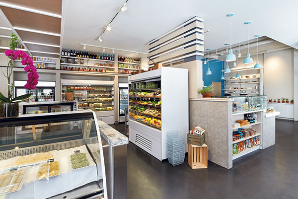
Merging retail and restaurants. At Centrolina, James Beard-nominated Chef Amy Brandwein wanted an approachable, chef-focused restaurant and bar, and then wanted to extend the experience to include retail for regulars looking to make dinner at home with prepared specialty items.
 Photo courtesy of Greg Powers Photography
Refined industrial. Thankfully, the “rustic industrial” look is evolving into something more refined. At Commonwealth Joe Coffee Roasters, we used Shou Sugi Ban wood with a rough texture that reflects the bean-roasting process and becomes a major design element. The space feels edited yet still warm. We are also noticing spaces are becoming more straightforward architecturally, lending focus to major features — in this case, the glass cupping room and the barista counter. The visual focus and purpose lend an unspoken credibility to the client’s brand that guests sometimes can’t identify but feel when they’re in the space.
 Photo courtesy of Greg Powers Photography
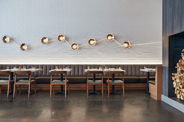
Signature elements that brand a space. Custom lighting adds unique personality and can even create social media buzz. Our constellation wall lighting at Centrolina (above), Chrysler-building-style light columns at Silver, and Acapulco-chair inspired fixtures at Buena Onda frequently turn up in Instagram posts and are signature features in each space.
 Photo courtesy of Michael Moran
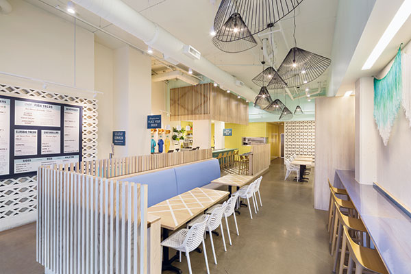
California-inspired style.The light, airy, beachy California aesthetic is very popular right now. Centrolina started that trend in Washington, D.C., and Buena Onda in Philadelphia has a beachy feel, too. We are even seeing our fast-casual clients forgo their graphic-heavy spaces for something a bit quieter and light.
 Photo courtesy of Greg Powers Photography
Rethinking nostalgia. We all reminisce about past eras when life was slower and better somehow. Clients often want nostalgic designs, but they need to be authentic, fresh and speak to their unique brand without being overly thematic. Our design for Silver used a European sensibility mixed with updated 1920s deco detailing to create a sophisticated diner.
 Photo by Michael Moran
Transportive hospitality experience. An immersive design that transports guests to a different place can be very powerful. Buena Onda is a new casual-dining concept that takes you to the beach towns of Mexico’s Baja Peninsula. The look, mood and service are all part of the complete harmonious experience. For example, the finish palette sets the tone, and the free beer offering in the queue line enhances that vacation-like feeling. There’s an ease to Buena Onda’s hospitality that the design supports.
