
Little by little, restaurants have been getting smaller. Partly a function of rising costs and partly due to consumers’ drift away from on-premises dining, it’s a trend that forces operators and designers alike to sharpen their focus and up their game. That’s because despite some obvious economic advantages — lower lease costs, fewer employees and typically higher per-seat profitability among them — small spaces can come with big challenges.
From functionality to flow to comfort, compact spaces leave no room for error or lack of careful planning. And few restaurants these days, no matter how petite and seemingly limited, can afford to ignore the importance of aesthetics and guest experience.
Small, of course, is relative. It might be a cozy, under 1,000-square-foot tavern, such as Rupee in Seattle; or Famous Dave’s new 3,000-square-foot prototype, less than half the size of the barbecue chain’s original unit size; or Firehouse Subs’ new design, shrunken from the previous average of nearly 2,000 square feet and 50 seats down to 1,600 square feet and 26 seats. The challenges, however, are similar: Fit in all of the must-haves and as many of the want-to-haves as possible in ways that are efficient, comfortable, safe, on-brand, code-compliant and photogenic.
During the COVID-19 crisis, many small, primarily dine-in restaurants have shuttered or changed their service offerings, at least temporarily. But some operators are taking this downtime to remodel and reconfigure in anticipation of reopening. Others are marshalling resources to take advantage of newly vacant, bargain-priced real estate for new concept launches or expansion when the pandemic passes, foreshadowing what could be a coming surge.
Stephani Robson, senior lecturer at Cornell University, whose specialties include restaurant design and consumer behavior research, feels small restaurants may have a better shot in a COVID-19 world. “With a small restaurant, you probably have just a couple of people working the back of house, the menu is typically smaller and overall operations are tighter and easier to control,” she says. “Large groups won’t likely come back for a while, and guests who do come back will value the transparency and relationship aspects that small restaurants provide. If your front of the house is configured smartly, you could have a strong advantage.”
In Robson’s view, smartly configured small dining spaces now include fixed seating, ideally high-backed booths with high partitions, and a focus on two-tops. “Booths and fixed seating are not only a great use of space,” she notes, “but they also help create a sense of order, which is always important when space is limited. And our research shows that consumers consistently prefer booths and spend more when seated there than at loose tables. They like being able to feel secure and safe and comfortable in their own little space. That will be even more important post COVID-19.”
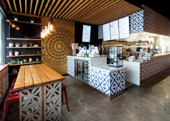 Keeping the colors and material palette limited while creating standout focal points is a solid approach to small dining spaces like those at Lupe’s Mexican Eatery in Dana Point, Calif. Image courtesy of Jenny Siegwart
Beyond seating, Robson says other aspects of small spaces that have a big impact on the guest experience, and that are often overlooked, include entryways and coat storage. “If you’re in the Midwest or Northeast, for example, you can appreciate the entry experience in a small restaurant. Usually, there’s not enough space for an airlock or any sort of arrival area. You’re coming right into the dining space and there are often tables right near the door to maximize seating, but every time the door opens a whoosh of cold air rushes in. The arrival should be aesthetically pleasing, but you also really need to think about how you manage that entry area and overall thermal comfort.”
Poor lighting is another common design misstep in small restaurant spaces. Whether due to budget limitations or lack of understanding of its impact, it’s often given short shrift, notes Brett Andersen, principal designer at New York-based lighting design firm Focus Lighting. “The thinking is often that it’s a small space and already intimate. Operators may try to go with just one or maybe two layers of light,” Andersen says. “If you’re trying to make an impression, tell a story and create a space that guests will want to spend time in, a more nuanced, multilayer approach is always called for. Small spaces need to be made to feel rich and inviting and that has much to do with how they’re lit.”
Andersen references Wayan, a French-Indonesian restaurant project in New York. The design for the 80-seat, 2,000-square-foot space features multiple layers of light, from decorative pendants and architectural fixtures, to recessed accent lights above each table, to LED strips recessed into bar millwork and more. Together, the various layers create a gently filtered, jungle-inspired atmosphere and subtly organize the visual composition of the space.
“If you just hang a chandelier in the middle of a dining room ceiling and that’s the main source of light, everything at table level across the dining room is going to be the same brightness,” Andersen notes. “Not only are you losing the advantage of being able to direct the guest’s eye, but the space is evenly lit and that’s pretty boring. The small restaurant is about the experience at the table, especially if you’re going to spend an hour or two there. No matter how small the restaurant is, you have to find opportunities to layer light.”
Indeed, when footprints are small, designers are especially challenged to eke out such opportunities for creative and impactful design solutions. For advice on how to do so, rd+d reached out to four designers to learn how they make the most of tight situations. Read on for a few of their big ideas.
 The new palette at Erbert & Gerbert’s includes warm wood tones and white counters, wall tiles and ceilings that create a fresh and airy feel. Bright, fun colors and neon accents add energy and visual excitement. Images courtesy of PlanForce Architecture + Design
Michael Mora
Heliotrope Architects
Co-Founder and Principal
Seattle
For Heliotrope’s principal Mike Mora, designing small-footprint restaurants is a labor of love. Like the spaces themselves, such projects are more intimate, oftentimes bringing an individual chef-owner’s vision to life and creating little dining gems that add character to neighborhoods. But there’s a fine line. While small footprints can work beautifully for certain concepts, too small can be problematic. That’s particularly true, Mora says, when they’re in buildings with little natural light and difficult access to the roof for staging mechanicals.
“A lot of our projects are in older, multistory buildings. There has to be a pathway for exhaust out and fresh air in,” he says. “Code restrictions around air quality are only getting stricter, and in many locations you need to also have a scrubber, which is big and expensive. Code requirements for things like accessibility in aisles and restrooms, and for kitchen elements such as hand sinks, three-compartment sinks, dump sinks and dish stations take up a lot of space, too. So, while we love small restaurant spaces, we have to make sure early on in the process that we’ll be able to fit in all of the required elements and have enough left over to create an experience and generate revenue. We get it all down on paper at the schematic level to be sure we don’t miss anything.”
One of Heliotrope’s smallest projects to date is Rupee Bar, a 700-square-foot jewel box serving elevated Sri Lankan and South Indian-inspired small plates in Seattle’s Ballard neighborhood. A 2020 finalist in the James Beard Foundation’s Outstanding Restaurant Design Awards, Rupee seats just 26 in its long and narrow space, comprised of a bar on the right side, a banquette with fixed seating on the left, and a small kitchen and restroom (just one required, because of its size) at the rear.
Rather than opening the kitchen to full view, the owners opted to keep it secluded behind the back wall, but an opening in the wall functions as the pass-through and gives guests a glimpse of the action.
“Rupee was interesting because it’s was so, so small, but it’s also in an old, single-story building,” Mora notes. “There’s a back door and we could go right through the roof with the mechanical systems. We didn’t have any light coming in from the back of the restaurant, which we always prefer, but we were able to install skylights.”
The building’s old storefront was replaced with a new facade that features tall, slender double windows with painted wood frames. “We wanted to be able to open them up and establish a strong connection to the street,” says Mora. “When you drive by or walk by at night it looks very warm, cozy and inviting. That really ups the appeal of small spaces.”
Inside, the original concrete floors were stained and sealed, and the ceiling’s wood frame exposed. Even in small footprints, Mora advocates filling up the space and creating a sense of focus and comfort. At Rupee, warm Oregon walnut wood used on the bar, tabletops and casework, combine with deep, peacock blue walls to create a cozy vibe while polished brass accents, decorative Indian clay tiles and slatted pendant lights add interest.
Of the palette choices, Mora says, “With smaller spaces, it might seem the default would be light colors and lighter materials. But just when you think that’s the obvious answer, you can get spun in a different direction that turns out to be what really works for the space and the brand. Sometimes, simply embracing the smallness and accentuating it with richness and color is the better way to go.”
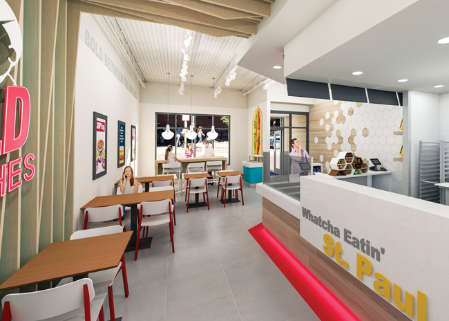
 The new prototype for Erberts & Gerberts, a Minnesota-based QSR sandwich chain, has limited seating but a variety of table size and height options.
David Michael
Tecture Design & Fabrication
Principal and Creative Director
San Diego
Small restaurants are a little like boat interiors, according to Tecture’s Principal and Creative Director David Michael: Both are very compact and must be extremely functional.
“From our point of view, tighter parameters inherent in small spaces lead to tighter designs. When spaces are big, there are few guidelines and the spaces can seem overwhelming,” Michael says. “When there’s not much space to work with, we can drive the design much quicker, cut out the fat and go straight for whatever the ideal situation is for the space and the brand.”
Once the scope of a project is developed, Tecture’s team starts by assessing what elements are necessary to bring the client’s vision for the concept to life and applying a “triage system” for setting high, medium and low design and materials priorities. “If we can establish that hierarchy first, it really helps provide focus for the entire design process,” Michael says. “We also try to find that one thing about the space that’s going to stand out. Maybe it’s a tall ceiling, or a long and narrow footprint, or one great window. Use whatever you have because you might not have much to work with.”
As for finishes and materials, Michael recommends keeping the palette limited and avoiding clutter. Even when space is tight, however, he works to incorporate varied seating options and multiple elevations, whether in flooring or ceilings. Tecture’s mantra for all designs, but particularly for small spaces, is “clean, bold and clever.”
It’s an approach the team took when designing Lupe’s Mexican Eatery in Dana Point, Calif. With two units operating successfully already — one in San Diego and a second in Huntington Beach — Lupe’s owners commissioned Tecture to create a design for its newest location that would enhance the brand and position it for future expansion.
“The space was small — around 1,200 square feet total, 800 in the front of house — and the budget was fairly low,” Michael says. “We really had to focus on just a few key materials and key moments.”
Simple, budget-friendly plywood slats were used to add visual appeal and sound absorption in the ceilings, which are hung lower over the seating area, and along the back wall. Floating tabletops and adjoining wall panels, also plywood, are milled and stained with brand-appropriate geometric patterns that add interest at eye level throughout the space. “They’re pretty simple,” Michael says of the floating tables. “We just wrapped them up the wall. It’s a small taco shop and the tables are small, so we wanted to do something to accentuate them. Their design also enables quick and easy cleaning because there are no bases to work around.”
The existing concrete floor was stained and original concrete wall sections between the wood panels were color matched to the stain used in the panels. Varied seating — a high table in front and lower, larger tables in back — accommodates multiple guest occasions while vibrant tile framing the counter and open kitchen adds color and pizzazz. “We used that one tile pattern all over the space, almost color blocking with it,” Michael says. “Even though the space is small, the tile really distinguishes it and brings it to life.”
 Open ceilings can provide height and make smaller spaces feel larger than they are. RODE Architects applied that strategy to SRV in Boston. Images courtesy of Gustav Hoiland
Ryan Schroeder
PlanForce Architecture + Design
AIA, President
Minneapolis
Designing restaurant spaces is, in many ways, a back-to-front exercise at PlanForce. The design studio’s recent work includes a new prototype introduced last summer for Erbert & Gerbert’s, a QSR sandwich chain based in Minneapolis whose footprints can range from 900 to 1,400 square feet.
“Where space is tight, we typically spend quite a bit of time compacting the kitchen as much as possible while ensuring it accommodates everything the operator needs for functionality and for storage, which often doesn’t get sufficiently planned for. We also carefully evaluate the space for things like flow and code requirements for accessibility, which can eat up valuable space. Those elements are always our starting point,” says Ryan Schroeder, PlanForce president. “Once we have them established, we have a better idea of what’s left over for the dining experience and for all of the other amenities that we want to include. And at that point, we start working with some geometries and placements, and figuring out the customer experience.”
Even in small spaces, a key to creating appealing guest experiences, Schroeder adds, is providing a mix of “microenvironments” in the front of house.
“Operators often feel like they don’t have much to work with in these spaces, so they just do as large a dining room as possible,” he says. “But we always try to provide guests with different seating options and slightly different vibes throughout the space. Even if it’s done on a very small scale, it’s very beneficial to the design to offer variety within the space.”
Erbert & Gerbert’s’ new design allows for limited seating but includes a variety of table size and height options. Wall coverings and large graphics add bold color and brand messaging to the otherwise clean, neutral interior palette and help break the space into zones. A feature wall with imagery of the chain’s namesake characters includes structural slats that carry across the otherwise open ceiling to the counter area. Red colorways with footlights along the counter subtly delineate traffic patterns.
“We really focused on the customer experience and how we can efficiently lead them through the space,” Schroeder notes. “And we incorporated some rich materials. In small spaces, guests are closer and notice everything more. Extra details and richness around touchpoints are important.”
The new palette at Erbert & Gerbert’s includes warm wood tones and white counters, wall tiles and ceilings that create a fresh and airy feel. Bright, fun colors and neon accents add energy and visual excitement. Says Schroeder, “Instagram-worthiness is a big deal and you see some really dramatic approaches to creating that in large spaces. But even though space is at a premium, it’s critical to carve out and create those camera-friendly branded moments in small restaurants, too.”
Jessica Haley
RODE Architects
Associate, Head of Interiors
Boston
“Small restaurants are like little puzzles in terms of space planning,” says Jessica Haley, head of interiors at RODE Architects. “We start with the must-haves — back of house, storage, accessible restrooms, clearances, egress paths for both guests and staff, etc. — and then we know what we have to work with for the experiential part of the space. When you’re limited, that’s when you start to get very creative and you end up with more interesting designs.”
Among Haley’s go-to strategies for small-space designs is to use fixed banquettes, booths and/or stools as a way to maximize seating capacity while also keeping egress aisles clear. So, too, are maximizing natural light, providing an indoor-outdoor connection if possible, exposing the kitchen and keeping sightlines throughout the space open.
Whether light and airy or dark and intimate in mood, however, an overriding strategy when space is tight is to limit the number of different materials used. “As designers we have a habit of getting a little too materials happy, but we need to fight that temptation. What we don’t want to do to a small space is chop it up, visually or physically,” Haley says. “We try to make sure we’re staying in control with our palette. And we also really try to expand the view range as much as possible. So just as we’re not trying to break it up with too many materials, we’re avoiding tall partitions or anything that might make it feel even smaller.”
SRV, a bacaro (a Venetian-style wine bar) in Boston, isn’t overly small at just over 5,000 square feet total. But the bar, dining room, expo kitchen and restrooms together comprise 3,300 square feet on street level, while the primary back-of-house and storage areas sit one floor below. On the main level, especially, careful space planning was required to deliver on the client’s need for a neighborhood-friendly bar area as well as full-service dining room that could also handle private parties.
RODE’s design team focused first on opening up the space as much as possible, in part by exposing the original ceiling joists. “We wanted to get as much height as possible. Had we done a solid ceiling, it would have created a more closed feeling in the space,” Haley says. “We added a lot of acoustic material between the joists and did a very cool lighting installation that draws people’s eyes up to create a more three-dimensional experience.”
A new steel and glass facade also helped to open up the space. It provides for ample natural light but can also be completely opened when weather allows for an indoor-outdoor experience.
To save space in the bar area, RODE designed custom seating featuring fixed stools that swivel out from beneath a long counter that separates the bar from the dining room. To keep sightlines open, simple rope screens were installed behind that counter. “The client asked for a little division between dining room and bar, but we didn’t want a solid partition,” Haley explains. “The rope screen is see-through, but it reveals the dining space in a more filtered way.”
Another design feature that stands out in SRV’s bar, one that Haley notes could easily get lost in a larger space, is its custom flooring. Inspired by the concept’s Venetian roots, it incorporates concrete tiles cut in the shape of fish scales and inlayed into the wood beneath the stools. Such custom touches are often possible to do when spaces are smaller, she adds. “In a lot of cases, budgets go farther,” she says. “Operators can spend more on custom features and finishes to really make their small spaces distinctive.”