
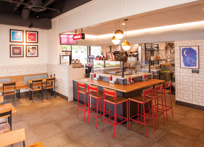
 Wendy’s is now showing its commitment to quality through its artwork and material selection, including solid oak tables and seats as well as wood paneling and trim. Image courtesy of Tom Dubanowich for The Wendy’s Company Drive through any city in America and what will you see? You’ll likely spot McDonald’s golden arches, Starbucks’ green mermaid and numerous other well-known restaurant chains’ iconic visual elements.
Get closer to these heritage companies and you’ll feel the brand image a little more deeply — because while they all want to emphasize their legacy, they’re often doing it with a very subtle approach, and one that’s likely to resonate with customers in 2019.
Long John Silver’s turns 50 years old this year, and in 2015 the company’s executive team decided it was time for a brand refresh. Leigh Ann VanDam, senior director of development and real estate, spearheaded the endeavor, and created a new image — dubbed True North — with options at different price points so franchisees could choose based on their own budgets.
The result is new stores and retrofits that focus on what really resonates with customers. To find out which elements most resonated, VanDam jumped into research. “I started reading memoirs and every online anecdote such as social media posts I could find,” she says. “That’s when I realized what we needed to keep: anything that was a direct correlation to the heart and soul of Long John Silver’s. So, some elements needed to be kept, some needed to be revamped and others were best retired with our legacy.”
VanDam’s goal was to discover what emotional connection Long John Silver’s had to its core, long-term repeat guests, “but also start drawing interest from new customers, and not through gimmicks but through reminding them who we are and validating that,” she says.
Her research led her to four essential elements that customers feel are core to Long John Silver’s: exterior nautical light fixtures, wooden decks and posts on building exteriors, the captain’s bell by the exit that customers ring to indicate they had good service, and a cupola on the roof of the Cape Cod-style buildings.
VanDam wanted to keep the first three of these, but they needed updating. She chose to move the nautical light fixtures to the inside of the restaurant because “although they are the same size as before, it reduced them to a more human scale.” The wooden decks and posts she moved up to the exterior walls. The originals, she says, “did not provide a stable, firm and slip-resistant surface,” but now, they “provide that opportunity for nostalgic connection with our guests upon their approach.”
The captain’s bell was essential, VanDam says, “but we knew we had to update it, and it’s taken on a more prominent role.” The True North bell is real bronze and the latitude and longitude coordinates of the restaurant’s location are etched into it. “It gives each restaurant a sense of place and that’s imperative these days,” she explains. “It’s important to have something specific a store can own because in this industry, where replication and a sense of a brand’s identity is so important to a brand’s success, these little details set them apart and gives it a twist.” She kept the bell in its place, just by the main entrance.
She decided the cupola and the Cape Cod roof had had their day and chose to retire them. The main reason for this was that the cupolas were originally illuminated, but many weren’t allowed to be illuminated anymore “so they were losing their original intent, to be a beacon,” says VanDam. The cupola “was the most iconic architectural element distinctive to our Cape Cod design. Any attempts to force the cupola into our new restaurant design result in a bastardizing effect. It seems irreverent.”
Instead, she’s added a sleek ship’s rail and navigation lights — one green, one red — onto the buildings’ parapets “so they draw your eye and act as a beacon with a more modern flair.” They won’t, she adds, be as obvious as the cupola, “and customers won’t think of them for more than a split second; they will be more subtle.”
 Long John Silver’s moved its exterior nautical lighting elements indoors and updated its kitschy captain’s bell to a real bronze bell with the restaurant’s latitude and longitude coordinates etched into it. Image courtesy of Aerial State Media
Subtle Is the Watchword
Similar to VanDam’s thinking, Wendy’s, with its Smart 2.0 design, which it rolled out last spring, wanted to reveal its core values but in a much more restrained way than previous incarnations.
Essential to Wendy’s is its founder, Dave Thomas, who wanted guests to feel they were coming into his home when he opened his very first store in 1969. He wanted the stores to be warm, comfortable and inviting. “About five years ago, we wanted to remind the consumer of those core values, so we were very literal about putting our values on the walls,” says Barry Baughman, Wendy’s manager of design. “We used Dave’s quotes and his images to underscore that.”
Also important to Thomas was quality, but instead of stating that explicitly, Wendy’s is now showing it through its artwork and material selection, including solid oak tables and seats, and wood paneling and trim. It’s about putting quality “where it matters the most,” Baughman says. “And we’re being respectful of our consumer and doing it in a much more subtle way that connects with them emotionally.”
Another key element to Thomas was adoption, which he was passionate about. “We’ve always had artwork that talked about the Dave Thomas Foundation for Adoption and how we support kids,” Baughman says, “but in the new design, instead of telling the stories, we do it through quotes and imagery of the adopted kids and their families.”
Now, the restaurants feature paintings that illustrate the story of a family or an adopted child. One, for example, features a quote from the adoptive mother of two children set against an image of the night sky. Underneath each painting is a plaque that tells the story of the family and how Wendy’s helped.
Rather than describing the functions of the foundation, Baughman says it’s better to make an emotional connection to guests through a true story.
“We had a lot of conversations like, ‘Is it more important to show the quality or tell customers we’re quality?’” he says. “And things like quality and doing the right thing, these are things that are better shown. We get a deeper emotional connection.”
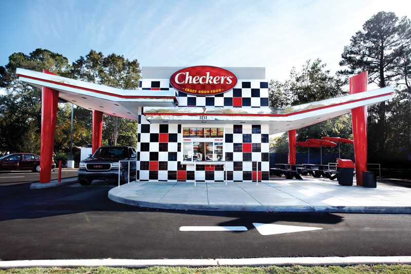
Checkers and Rally’s updated its stark black-and-white checkered exterior tiles in 2016 with the addition of random red tiles “to be fairly subtle,” says Director of Design and Construction Bret Cunningham. The restaurants featuring the 4.0 design are doing well, with sales up around 10 percent. The design retained the chain’s polished stainless-steel awnings that sport a red stripe, but there were some changes. These include switching from a neon light to LED, which is easier to maintain and also less expensive. The 4.0 design also exaggerated the awnings, staggering them in elevation and extending them out farther from buildings and tilting them upward.
Checkers/Rally’s has also retained its exterior red fiberglass umbrellas in its seating areas, which are nonnegotiable and differ from most QSRs and the use of canvas umbrellas. “They’re an unusual shape and not very common,” Cunningham says. “Guests often identify the umbrellas and associate them with our brand, prior to even seeing our signage.” Because the umbrellas don’t fit any historical time period, they fit the brand’s nostalgic style and don’t look dated, he explains.
One change that was not subtle: the double drive-thru that the chain was known for has been downsized in many locations to a single drive-thru because “the doubles weren’t penciling out,” says Cunningham. The change has made for a nimbler brand, allowing the chain to go into smaller locations and to use the added outdoor space for additional seating. Removing the lane hasn’t affected brand equity or sales, adds Cunningham.
 The double drive-thrus at Checkers and Rally’s have been downsized in many locations. It made for a nimbler design, allowing the chains to go into smaller locations and utilize outdoor space for additional seating. Image courtesy of Checkers and Rally’s
Throwback Style
A&W is taking a different tactic. Eschewing subtlety and instead drawing attention to legacy elements, the chain is employing what it calls Hip Nostalgia. It takes the best of the past and makes it relevant to today’s consumer while still capitalizing on the affinity Baby Boomers have for the brand, says Vice President of Marketing Sarah Mueller.
Key elements of this, she explains, include the restaurants’ angular mid-century-inspired roof line, colorful pop art created with retro techniques that aren’t overly computer generated, and references to the century-old chain’s start as a small roadside root beer stand. New items are created using old styles, so they look like they’ve been done by hand — everything at A&W was hand-painted until the 1950s — and that includes everything from the menus to the visible brushstrokes in the paintwork. “We wanted this subtle touchpoint,” Mueller says.
And one element A&W is resurrecting, after it fell into disuse in the first decade of this century, is it bulls-eye logo — the original A&W logo that prior to 2000 was featured in every restaurant. “We’re bringing it back to remind people we’re 100 years old,” Mueller says. The chain has even added this logo to its drive-thru.
Dairy Queen is also playing up its 78-year history through artwork. The Edina, Minn.-based chain has always featured black-and-white photos of old restaurants and music — mostly from the ’40s, ’50s and ’60s — and these are now updated, with some color shots, too. Another addition is history collages, starting in 1938, with the invention of the soft-serve machine, and identifying milestones in the evolution of Dairy Queen.
“We’re showing customers we’ve been around for a long time, and that helps establish the strength and durability of the brand,” says Director of Architecture Tom Reinen.