Design Insights on Boston's M.C. Spiedo Ristorante & Bar from lead designer Tanya Spaulding of Shea.
Read our full article on M.C. Spiedo here.
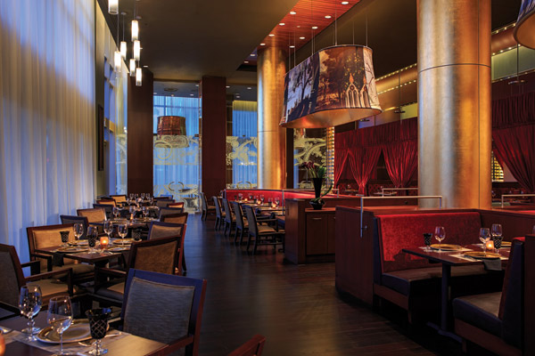
Floors, Ceilings
One of our philosophies is that we never want to spend the energy and money to overdesign floors or ceilings. That's not what guests should be looking at. They should be looking at the table, the kitchen, the food, each other, other design focal points. So we neutralize floors and ceilings.
Glass Graphics
Using a pattern from the Italian Renaissance period as inspiration, we created our own pattern and made it into a graphic for the large glass entry door and the big glass doors that separate the private dining rooms from the main dining room. It looks like etched glass, but it's actually a film applied to the glass. You still get transparency into the space, and it adds to the character of the concept in a simple, cost-effective way.
Catherine, Large
The graphic of Catherine de Medici overseeing the bar/lounge area really brings the concept together. We wanted to do something big and bold and unexpected. It ties together the light fixtures, the color palate, the menu, the patterns. We purchased an illustrated artwork of her headshot and created a large-format graphic from it, but we did it in black and white so that it wouldn't be too over-the-top.
Conversion Cost
Most of the expense comes when you start moving kitchen pieces around and having to do anything with structure or mechanical or electrical or plumbing. That's where costs add up quickly, not in the materials that actually create the look and feel you want.