
Cubbies have been making their entrance into restaurants, bolstered by the COVID-19 pandemic and consumers’ wish for contactless pickup.
Little Caesar’s, Mooyah Burgers, Fries & Shakes, and Capriotti’s Sandwich Shop are just three of the many chains offering this perk to customers, and last summer, Paramount Fine Foods opened Box’d in downtown Toronto, Canada, offering only cubby pickup.
Box’d customers order online before they arrive or from one of three in-store kiosks. When their food is ready, they take it from one cubby from a bank of 18.
But cubbies can be cold and impersonal, a missed opportunity for human connection. How can restaurants design for cubbies while remaining appealing?
We spoke to Eric Boulden, owner, Jump Branding and Design in Toronto who was behind the interior of Box’d, and he offered four best practices for designing cubby-focused locations.
1. Make it modern.
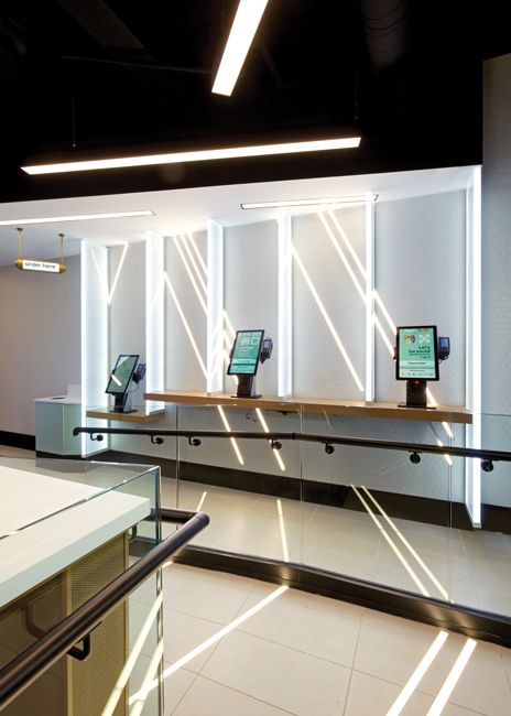 For Box’d, Boulden used lights to create energy and a sense of movement. LED light strips run up the walls and across the floors, creating a look that is “on the futuristic side, very modern with energy from the angles,” says Boulden. The strips “are like channels between the lines and they continue the feel of movement,” he says. They also draw the eye to the ordering stations on entry to provide a bit of wayfinding.
“It’s very crisp and clean, and we put light panels that are barriers between the three ordering stations,” says Boulden. “We wanted people to feel excited that everything is quick and for the whole concept to express speed.”
Boulden had to be careful not to make Box’d feel sterile, but the cubbies, even though they’re glass, bring some warmth, he says, because they have a blue hue. Boulden used touches of wood where he could — on the stools, and the counter — and some antique brass for a warmer metal element, which is used on the counter and some of the signage details. He also ensured the order stations had wooden counters, so they wouldn’t physically feel cold to customers when resting their hands or arms. “Where we needed some of that warmth was where you touch,” says Boulden.
He also made sure the color scheme of Box’d wasn’t a completely cold gray and that the lighting has a lower color temperature as opposed to being very bright.
2. Make the cubbies fun.
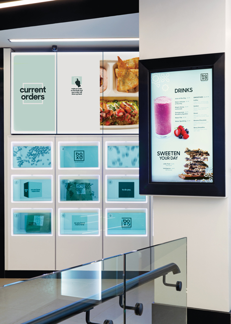 The Box’d cubbies feature revolving images and inspirational phrases to humanize the space, to link the fact that people “eat and share and live together,” Boulden says.
You want to play up the cubbies because they’re technology, but you don’t want it to be sterile, so the images help tell the story and they are where people are really focusing their attention. The design of the cubbies also bring some pops of color and, when customers’ orders are ready, their names appear on the cubbies as well as on a board showing current orders.
“Any time you can create movement to catch the eye it feels like there’s good energy in the place,” says Boulden, “Using that front surface to tell some stories is a quick hit — billboarding through words or images — and a chance to get another aspect of the brand forward. It was critical to this brand: That whatever differences there are, people all eat.”
Box’d’s cubbies are high end and open like an old cassette door, in slow motion “so everything feels special about it.”
3. Keep the energy high.
Customers at Box’d can see into the kitchen through a small window on either side of the bank of cubbies “which shows real people are preparing this food and that adds energy,” says Boulden. “There’s so much entertainment happening in this space with the cubbies having animation and the digital menu board having animation and the promotional digital sign when you first walk down the ramp. There’s an energy throughout the space.”
And the movement of the space flows along with the energy. Once customers enter, the wayfinding is clear “because of the glass wall that separates the seating area, customers are veered to the right to start their journey. It flows pretty naturally.”
4. Pay attention to seating.
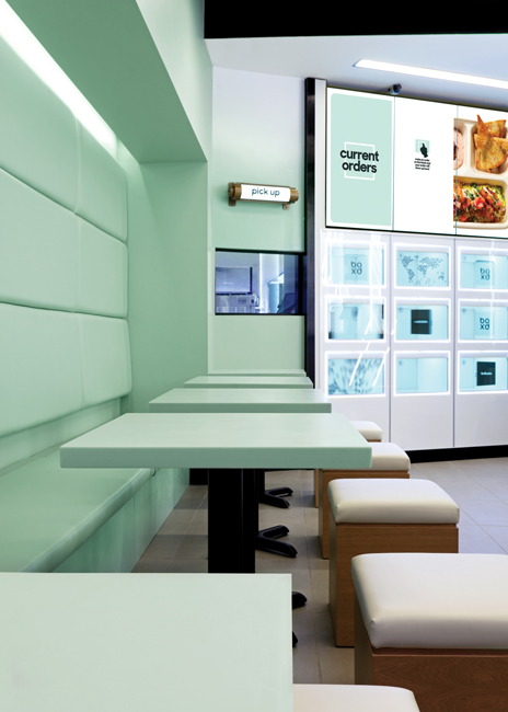 The seating fits with the brand, despite its separation from the ordering and waiting area, but it’s designed to feel slower. There’s some banquette seating with padded backs that help absorb sound “and take away some of that speed and energy,” Boulden says. Cube stools on the opposite side of the banquettes continue the box theme, as does a cut-out in the wall creating a box for the banquette.
There are five tables in the seating area and a counter with fewer than 16 seats. “It’s a very small space, but it’s just an area to enjoy your meal,” Boulden says.
The colors here are different, too. They’re a soft green versus white and gray on the ordering side.