Finding just the right space in the heart of New York City to open a new flagship store isn't for the faint of heart — or for the impatient.

Sao Paulo, Brazil-based Fogo de Chao started its Manhattan real estate search in 2007, found an interesting but cost-prohibitive space in 2008 and, three years later revisited that same location. This time, in a dramaticaly changed economic and real estate climate, the stars aligned.
Despite the fact that the building had too many levels and was torn apart in mid-project condition — abandoned by a previous tenant who'd lost funding — the Fogo team saw a diamond in the rough. Located on West 53rd Street across from the Museum of Modern Art, the multi-level space was now largely gutted, all the better to visualize its possibilities, says Larry Johnson, CEO of Fogo de Chao.
Commissioning renowned hospitality designer Jeffrey Beers and Shawmut Design and Construction, Johnson and Fogo's in-house architect Cliff Maillet set about planning to convert the 16,000 square feet of space into a dynamic, contemporary Brazilian steakhouse. Playing to the location's unique characteristics, the end result is a three-level, $16 million, 330-seat flagship store that is unmistakably Fogo, but that raises the concept's design bar to new heights.
 "The space was pretty crazy," Maillet says. "It had two levels on one side and three on the other side. The key to it was when we went in and removed the majority of that third lower mezzanine level to create a single, larger lower level. It effectively doubled the height of the space, as well, so that you can experience it from all angles."
The main, 192-seat dining room now sits on that lower level, as does the main kitchen and four private dining rooms. Three of those rooms can be used separately for smaller groups or opened up and combined to accommodate parties or overflow of up to 80 guests.
The dining space itself is anchored by an Escher-esque floating staircase that connects the dining room to the street-level entry and bar and up again to a separate mezzanine bar/lounge space. The staircase came partially assembled with the building among the rubble of the abandoned project, which was to have been a museum of Italian design. "They're exquisite," Maillet says. "One-inch-thick steel plate stairs that are laser cut. They were designed and fabricated in Milan and shipped over in segments. We knew that if we could figure out a way to use them they'd be a real statement feature."

Rob Finucci, project manager at Shawmut, notes that the original staircase design called for metal balustrade railings, which were missing and which wouldn't have fit with the look the team was after anyway. "We came up with a nice way to attach some structure to the stairs, which allowed for the use of glass railings that allow light down into the basement dining area," he says. "That was a major element of the job and required a lot of coordination but the end result is beautiful."
The wall treatments are also custom. Resembling large, off-set granite slabs, the concrete and fiberglass panels add interest to what is a massive, 58-foot-high flat structural wall. "We knew we needed something amazing for the wall because it's so huge. So we came up with the idea of this large, rusticated stone, textural wall of panels that vary in depth and size. It creates a larger-than-life texture that wraps the space and becomes the backdrop for all the other finishes and elements," Maillet says, adding that the panels' varying depths also help to diffuse sound.
Still another highlight and structural design accomplishment: a floating wine room that extends up from the dining room toward the third-level mezzanine bar. Framed with large steel buttresses that help to shore up the wall, it's a roughly 22-foot-long, glass-fronted room that holds up to 2,200 bottles. Servers access the room at entrance on the street level.

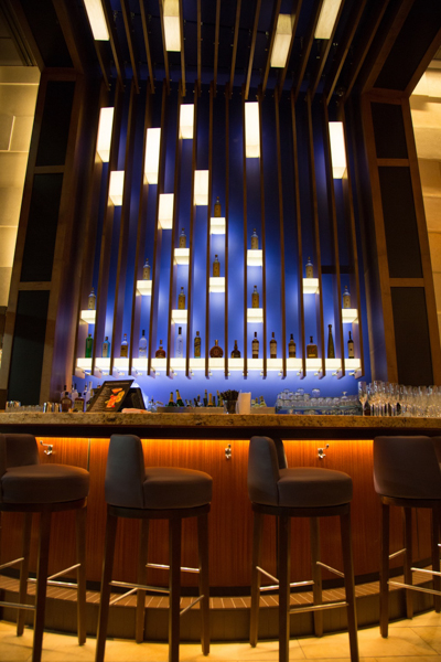
The restaurant's street-level entry space is fronted by 28-foot glass windows. A large structural column provided the perfect setting for a 17-foot relief replica of an iconic Brazilian gaucho statue. A small, semi-circular bar serves as a standalone attraction for the cocktail crowd, a gathering spot for parties and a waiting area for dining guests. In addition to the gaucho, this area's design is highlighted by a large wooden ribbed proscenium inset with alabaster lights. Starting as the back bar with cobalt blue lighting and built-in shelves for bottles, the proscenium wraps across the ceiling and back down the other side of the room, framing the view from the street into the multi-level space.
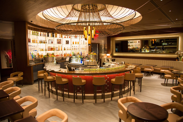
 Crowning the New York flagship unit is Fogo de Chao's elegant mezzanine lounge (pictured at the top of the page). Its centerpiece is a larger, circular bar above which hangs a custom-designed rope chandelier. "It's designed to be a social bar and it's a first for our concept," Johnson says.
The space provides seating for 48 and serves a menu of small plates and appetizers. A glass half-wall railing provides a bird's-eye view onto the restaurant's lower levels and out onto 53rd street.
Flanking the bar are walls hung with large framed mirrors, behind which sit 50-inch TV screens. "It's very subtle," Johnson says. "We live in a sports age and, depending on what the event is, it gives our guests the opportunity to watch without being constantly intrusive in the space. When the TVs are on, the screens shine right through the mirrors; when they're off, you just see the beauty of the room reflected."
Snapshot
Fogo de Chao, New York
Opened: December 13, 2013
Location: 40 West 53rd St.
Size: 16,000 square feet, three levels, 330 seats
Segment: Polished casual/Brazilian steakhouse
Build out: 32 weeks
Project Team
Larry Johnson, CEO
Cliff Maillet, Architect
Designer: Jeffrey Beers
Shawmut Design and Construction: Randy Shelly, vice president; Miguel Severo, superintendent; Michael Amore, senior project manager; Robert Finucci, project manager; Alyssa Tortolani, assistant project manager; Giuseppe Bartolomeo, assistant superintendent; William Zacotinski, assistant superintendent; Adam Baker, estimator


