 The restaurant’s designers made use of its high ceiling by designing a groin vault. Hanging from the vault is a custom surfboard chandelier. Images courtesy of Cameron CarothersRecognizing demographic realities, this retro diner chain is moving beyond its 1940s design to the broader appeal of the late ’50s and early ’60s.
The basics for a 1940s-style diner aren’t complicated: white floors and walls, red booths, big band and swing on the sound system, and burgers on the menu.
That’s exactly what Doug Cavanaugh put in place when he opened the first Ruby’s Diner 36 years ago on the Balboa pier in Newport Beach, Calif.
Cavanaugh didn’t stop there, though. He decorated Ruby’s Diner with pieces from the period, ones that he found at antique and memorabilia shops over the course of several months.
As a lover of vintage and retro, Cavanaugh especially enjoyed this part of the project. He wasn’t just indulging in a hobby, though. This approach made business sense first and foremost, he says. “No matter how young you are or how advanced you are, every once in a while, you want to escape to a simpler time. Ruby’s has always been about recreating that essence very accurately.”
Cavanaugh has been faithful to his vision for Ruby’s in the years since the first store opened. The chain now has 35 locations in five states. Almost all of these are decorated with unique pieces from the 1940s, most of which he sourced himself.
Cavanaugh’s desire to customize has done more than just create a more authentic experience. It’s also given almost every restaurant its own identity within the 1940s diner genre with design elements and touches that often connect the restaurant to its community very specifically. The Ruby’s in Carlsbad, Calif., near a train station, features a working model train set suspended from the ceiling. Ruby’s on the Lake in Irvine, Calif. has a collection of vintage model boats. Other Ruby’s restaurants feature bumper cars inside or classic cars parked out front.
Finding the Sweet Spot
While this customized 1940s approach has helped Ruby’s succeed, a few years ago, Cavanaugh realized it was time for a change. When the chain was founded, people who grew up in the 1940s were in their prime. Now, he says, they’re “going on to their reward,” making an update to the nostalgic tone necessary.
Changing Ruby’s for younger generations meant choosing a new period to recreate. For Cavanaugh, that wasn’t a difficult decision. To his ear, the rock ‘n’ roll of the mid-’50s has too much of a “rattle” for a good dining experience; the late ’60s is too “acid-y,” and the architecture of the ’70s is too much.
The late ’50s to early ’60s, with its smoother pop and Motown mix coupled with design ranging from googie (think boomerangs and amoeba shapes) to midcentury modern, made the most sense. It not only has a nostalgic appeal to those who lived through the era, but younger people are also drawn to the music and design of that period, Cavanaugh says.
The first of Ruby’s ’60s-themed diners opened in San Diego in 2014. These stores were googie inspired and featured midcentury modern fixtures and furniture. In March of 2017, the chain introduced another new design. While still a ’60s-themed restaurant, the chain and its franchisee, Steve Craig of Craig Realty Group, returned to Ruby’s hyper-local approach. Recognizing San Clemente as a center of 1960s surf culture, the restaurant was given a ’60s surf-inspired design.
Located in a high-end outlet center, some of the most eye-catching elements of this Ruby’s are dictated by the design of the center itself. One of these is the large groin vault (an architectural element created by the intersection of two barrel vaults) that defines much of the dining room. According to Rick McCormack, president of Studio McCormack, the team was able to create a groin vault because of a tower element in the outlet center’s design. The vault was a way to make the most of that volume.
The vault itself, though, presented another issue: high noise levels. To combat the noise, the design team included some additional elements in this feature. “We decided to add the spaced wood planks. The spacing allows the sound to travel through, and there’s insulation behind it to absorb the sound. That worked out well, and we didn’t end up with a noise issue,” says McCormack.
That wasn’t the only challenge presented by the vault. The main dining room seating is comprised entirely of booths. With such a high ceiling, the designers wanted to make the booths feel more intimate through the use of pendant lights. It didn’t make sense, though, to hang pendants 20-plus feet from the ceiling.
The solution was to create custom V-shaped metal structures that attach to the barrier between booths, says Studio McCormack designer Yuri Tag. Electrical wiring is strung through these structures, allowing pendants to hang just a few feet at each booth.
The vault helps create a dramatic, inviting space, and it also helps showcase one of the restaurant’s signature design elements: a chandelier featuring surfboards with the Ruby’s logo. Already an eye-catching piece, the chandelier is given extra oomph thanks to a motor that causes the surfboards to revolve around the center light.
As a surf-themed restaurant, other surfing-inspired touches can be found throughout the design. The booth tables, with bright colors and stripes down the middle, are surfboard inspired, while photos provided by local resources like San Clemente’s Surfing Heritage and Culture Center and the San Clemente Historical Society are used as art elements.
Since Ruby’s San Clemente has a retro surfing theme, many of its other elements also recall the era. Some of these are subtle, such as the wall paneling with boomerang art and the terrazzo-tiled floor. Others are more eye-catching, particularly the Airstream trailer that sits along the back wall of the dining area. This piece frames the opening and entryway to the semi-open kitchen and adds a “glamping” element to the design.
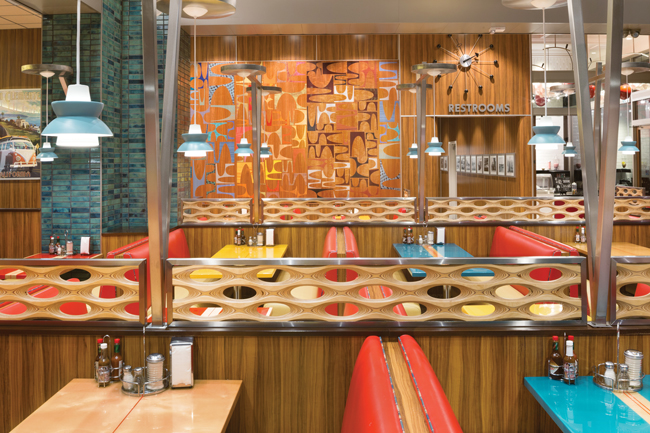 Ruby’s San Clemente’s dining room includes ’60s-style fixtures and finishes accompanied by surf-inspired touches like surfboard tables.
More Than a Dining Room
In addition to the main dining area, this Ruby’s location has three other distinct spaces, each with its own look and feel.
The largest of these is the outdoor patio, with seating for more than 90. Much of the patio’s style was set by the shopping center’s design, including the Spanish Colonial look and the red brick pavers. “We had to treat the center as the background of the canvas, and we added the painting on top of it,” says McCormack.
The added elements included period pieces such as surfboard shapes on the underside of the awning, tiki torches and era-appropriate outdoor lighting.
The highlight of the space, though, are custom-made, gas-fired fire pit tables. At each table, a protective shield sits around the actual fire. The tabletops, made of a white solid surface material, are shaped like amoeba, once again recalling the googie design of the 1960s.
Another unique space is the private dining room. With seating for eight, the space is tiki themed, with bamboo thatched walls and tiki heads. The room, says Cavanaugh, is one of the most popular places in the restaurant. While the room has just eight seats, it opens up to the patio, allowing Ruby’s to accommodate larger parties.
In addition to the tiki room, Ruby’s San Clemente has a second separate indoor space, this one used for the restaurant’s ice cream sales. According to McCormack, some Ruby’s locations do have ice cream sections, but they’re smaller and built into the main section of the restaurant, typically as an extension of a dining counter.
In this case, the ice cream section is its own room, off to the right of the main dining area. It’s been given a dining room entryway and an exterior entry door. That exterior entrance, McCormack says, is designed to boost sales from foot traffic, creating a whole new revenue stream for the operation. “The location in an outlet center means there’s a great number of people walking around. The ability of people to come in though its own exterior entry means you don’t feel like you have to eat at Ruby’s to get the ice cream. You can just walk in and order directly from the ice cream counter.”
The space itself has a very classic ice cream shop look, including small hexagonal tiles on the floor and beadboard that’s been painted with pink, red and white vertical stripes, giving the room a whimsical feel. It also features marquee lights that declare “I Scream, You Scream.”
The space’s other key design element is a set of light fixtures featuring a giant whipped cream dollop along with a giant custom-made cherry. The original intent was to have lights in both, “but we thought the red glow might not be so pleasing, so we took the light out of the cherry and limited it to the whipped cream!” Tag says.
 The exterior includes surf-themed touches like the surfboard shapes on the underside of the awning as well as ’60s design elements, like the amoeba-shaped patio tables with built-in fire pits.
Designing Versus Building
 The tiki-themed private dining room features thatched walls and tiki heads.One of the notable aspects of this project, says McCormack, is how smoothly it went. The restaurant was being built in an entirely new development, so there wasn’t any existing infrastructure to work around or surprises when the walls were opened up.
In addition, Craig, the franchise owner, is also the developer of the outlet mall where this Ruby’s is located. While he played by his own rules for the design and exterior look and feel, this naturally made the entire landlord approvals process quicker and easier.
Instead, many of the challenges involved the design itself, specifically the gap between designing something and then actually having it made, McCormack says.
Take the surfboard chandelier, for example. Obviously not a stock piece, this unit was custom designed and made by a fixture company. An issue with the design, however, caused it to stop rotating. Fortunately, this occurred during the construction phase, making it easier to coordinate a replacement. Unfortunately, to remove the old chandelier and install the new one, contractors had to uninstall the host station that sits directly below the fixture.
The groin vault where the chandelier is installed was also a challenge. The design itself is complex, so building it was a challenge. The team had to go through multiple contractors before they could find one that was up to the task.
“The groin vault is a very complicated geometric structure with curves on curves. We also wanted to do this really fine planking on it, so all the joints had to be perfect. It really took a very skilled craftsman,” says McCormack.
The Airstream was another issue. Initially, the design team thought the general contractor would have to build a faux Airstream for the space. As it happened, the contractor had a contact with an Airstream collector/dealer. The contractor was able to acquire a unit for the project, which it then cut lengthwise for installation.
The wall that the Airstream was intended for, however, is actually longer and taller than the actual Airstream, presenting a mismatch.
The contractor’s solution was to fabricate stainless-steel panels that it could add to the Airstream, making it both taller and longer. This required cutting the actual Airstream sections into additional pieces, welding everything into one unit and smoothing out the seams of the weld. “[The contractor] did an amazing job, all the way down to having the taillights light up. The detailing on it is amazing,” McCormack says.
Details and Detailing
Despite all the work put into this design and the success the restaurant has seen in the year-plus since its opening, the San Clemente Ruby’s design won’t be replicated. This is in part due to Ruby’s desire to localize each store to its community. Another Ruby’s currently under renovation, for instance, is being given a yacht theme reflecting the area’s many yacht clubs.
Beyond that, though, is a shift in Ruby’s growth strategy. Labor costs, predicts Cavanaugh, will make it difficult to build full-size, full-service family restaurants in the future. Ruby’s, then, is focusing on building smaller stores with limited services — even just counter service in some cases.
The restaurants will stick with the 1960s theme and lean heavily on googie design. They won’t be cookie-cutter, though. “That’s boring for me, and it’s boring for the guest,” says Cavanaugh. Instead, they’ll be designed to fit their neighborhood while still providing a retro diner experience. “We’re going to be taking advantage of locations that perhaps didn’t work for a yogurt shop or didn’t work for a taco stand and then morph those into these unique locations. They are not going to share a lot with the surf theme and the yacht club. It’s going to be a classic slice of Americana. It’s still going to be in the Ruby’s family but its own version.”
 Ruby's San Clemente, CA Floor Plan
Snapshot
- Headquarters: Newport Beach, Calif.
- Concept owner: The Ruby Restaurant Group
- Concept: Retro American diner serving breakfast and classic American fare including burgers, fries, shakes and salads
- Segment: Casual dining
- Location: San Clemente, Calif.
- Units: 34
- Opened: March 2017
- Size: 4,880-square-foot interior and 1,715-square-foot patio
- Seats: 113 inside, 96 outside
- Real estate: Endcap in a high-end outlet mall
- Design highlights: 1960s California surf-themed restaurant with a groin-vaulted ceiling and a rotating surfboard chandelier. Other highlights include a tiki room for private dining and a sectioned Airstream trailer framing the kitchen entry and pass-thru window.
- Build-out time: Six months
Project Team
- Interior and exterior design: Studio McCormack
- Franchise owner/operator: Craig Realty Group
- Architect: JC Marvick & Associates General contractor: LJ Russell Construction, Inc.
- Kitchen design: Avanti Restaurant Solutions