Opening new locations is a common occurrence for restaurant chains, but sometimes branching out can bring significant changes. As brands expand into nontraditional locations, or even just a new geographic area, challenges and exciting opportunities abound. Here we spotlight three brands and how they moved into nontraditional locations.
Airport Adaptation
This spring, Miami-based Spring Chicken will open its fourth restaurant, this one inside Miami International Airport. The location will be a first for the brand in two key ways: It’s the first nontraditional location, and to be in the airport, the fast-casual operation had to transform into a full-service restaurant with a strong grab-and-go component.
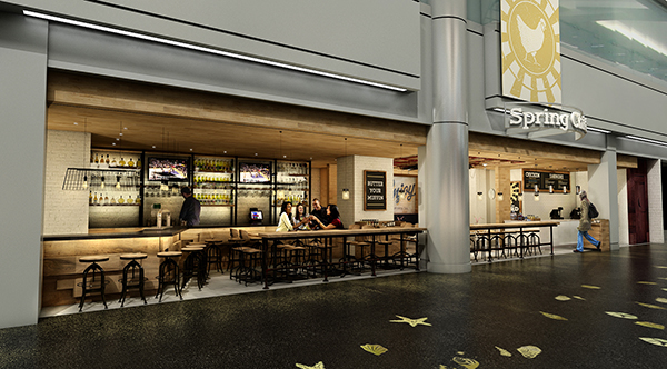
“This works at the airport because you have to have the turnover. Here, we’ll end up doing north of $7.5 million, whereas our other locations are closer to $2.5 million,” says CEO and founder John Klunkel.
This new location will include an entirely new element: a bourbon bar with a full mixology program. This new feature and the bar seating will consume about 50 percent of the space. Other Spring Chicken locations offer only beer and wine.
To emphasize the bar, Klunkel opened up the front of the restaurant by removing existing glass walls — those that face out onto the airport concourse. “We wanted to draw people in and make it look warm and inviting,” he says. “Bars near a front entrance also create a lot of energy.”
Spring Chicken also made changes to the materials in its Miami International location to make it easier to handle airport logistics — despite Klunkel’s initial resistance. “I’ve always stayed away from composite materials, but it’s amazing how good these things are now,” he says.

The site will feature composite wall materials that mimic the natural brick that appears in the chain’s three other restaurants. “We normally use Chicago brick, but it’s hard to truck around concourses. So we found a fiberglass composite that was molded, and you wouldn’t be able to tell if you were standing three feet away,” Klunkel says.
The composite brick also meant a space savings of 7 inches in depth since it’s only 3 inches deep, an important factor in a small restaurant. This location measures 1,500 square feet — less than half the size of two of the three other Spring Chicken restaurants, two of which consume 4,000 square feet; the third is only 1,400 square feet.
A final bonus to using the composite materials: It’s about 30 percent cheaper in labor and materials cost.
Adjacent to the bar is the restaurant seating area: a light, bright, natural space that contains around 10 tables made from reclaimed wood, as with the traditional locations. The grab-and-go area is on the other side of the restaurant, making it easy for rushed customers. It features two cashiers and an open grab-and-go case.
Digital menu boards above the grab-and-go area are eye-catching and easy to change out. Though Klunkel prefers chalkboard menus in line with the brand, the ease of use of the digital boards, as well as the ability to show pictures of the food for non-English speakers — an important attribute in an airport — meant they won out.
The final big challenge was the airport utilities, which ran above and below the restaurant to different floors. “We had to get really creative and work with existing electric and gas lines with specific loads,” Klunkel says. “You just have to make it work.”
Geography Is Destiny
There’s a distinct difference between the East and West Coasts. When fast-casual chain Cava expanded to Los Angeles from the Atlantic seaboard, its designers realized they needed to make some changes for it to fit in.
Over the past year, the health-focused Washington, D.C.-based fast-casual chain, which serves salads, grain bowls and pita sandwiches, has opened three locations in and around Los Angeles, with another three coming in 2017. Right now, the concept has 22 locations between the two coasts.
 Cava at Montgomery Mall
From a design perspective, Cava executives wanted the West Coast stores to be brighter and airier. “We have used a lighter palette on the Los Angeles restaurants,” says Peter Hapstak, owner of HapstakDemetriou+ design studio in Washington, D.C., and lead architect for Cava. “We’ve pushed the palettes to be whiter, so it fits the beach culture, the West Coast vibe.”
The East Coast stores tend to feature darker colors, often with black or brick concrete floors. “There tends to be a broodiness about them, but the West Coast stores tend to be brighter,” Hapstak says.
Cava’s West Coast units also all have patios, befitting the year-round clement weather, though that may change as the concept expands into Northern California. The outdoor seating also helps open up the restaurants, Hapstak says. The design of the West Coast units makes extensive use of glass to merge the inside and outside. Because of the large patios, which typically contain 10 to 20 seats, the interior footprint is usually 20 percent to 25 percent smaller and contains just a dozen or so chairs, though the overall locations are slightly larger than their East Coast counterparts.
According to Hapstak, having so much seating outside “brings a vibrancy and the visibility to the restaurant, and that’s a positive proposition because you see people rather than just a storefront. It’s much more lively.” This openness also comes from higher ceilings and more — and bigger — windows, he says.
 Cava in TopangaIt’s not hard to highlight a West Coast vibe when you’re actually on the West Coast, Hapstak says. For example, most of Cava’s California restaurants are in one-story buildings. In contrast, the chain’s East Coast locations are typically on the first floor of a multi-story building. And the core and shell of the West Coast buildings are made of wood truss with steel in the roof and concrete block walls. “This type of building doesn’t exist on the East Coast,” he explains.
On the West Cost, Cava has also exposed much of the wood structure of the buildings, “which plays well with their palette, creating warmth in the spaces,” says Bill Young, senior project manager of HapstakDemetriou+. “This is a far cry from the concrete, glass and steel of the East Coast.” Cava is also using murals on the outside of some of its West Coast buildings to add color and flair.
A Built-In Drive-Thru
In January of last year, Smoothie King opened inside a former bank in Nashville, Tenn. This is just one of the New Orleans-based brand’s 750 U.S. locations to open inside what was a banking facility, and there’s a significant advantage and disadvantage that comes with each.
 Smoothie King
On the plus side, says Ron Stuart, the company’s designer, banks have drive-thrus, “and that’s one of the reasons they are good. Since they have already been approved, we don’t have to bother with the paperwork or getting it grandfathered in. And we don’t need any restructuring to do the drive-thru.” And that works perfectly for Smoothie Kings, he says, since typically, 70 percent to 80 percent of business is drive-thru; in Nashville, it’s 70 percent.
The entire Nashville restaurant was designed around the existing drive-thru, which was turned into a double drive-thru. Additionally, a pickup window was added on the opposite side of the building from the drive-thru to aid in the flow of car traffic.
The classical architecture of typical bank buildings, however, often presents a challenge. “We do our best to make these resemble our typical exterior design standards,” Stuart says.
Another negative, though, is there’s usually a hefty bank vault that’s impossible to move and can be difficult to work around. “They are really expensive to take out, so you try to figure out a way to use it,” he says. If it’s on the side or in the basement, he typically uses it for dry storage. But in Nashville, it’s on the back wall, directly in front of the main doors, so he made it into a 240-square-foot private dining room.
At this location, the Smoothie King franchisee, Paul McCullough, painted the dining room interior with the brand’s trademark white walls with red accents and hung up Smoothie King-approved graphics. The room is filled with a communal table that seats eight and lit with dimmable LED lights in the ceiling and standalone lamps. “We made it into a showcase piece,” Stuart says, “but if it had been in a corner, I would have hidden it.”
Initially, McCullough planned to use the vault for storage, “but I decided that would be a waste and decided instead to use it for a nice gathering place room. It is a topic of conversation in the community, and many people have come to our store just to see our vault,” he says. The vault, he says, is popular with all kinds of groups — from families to school kids and women’s groups. It can be booked in advance.
There was one final obstacle to overcome with the Nashville Smoothie King: The location was enormous. Most of the concept’s locations measure around 1,000 square feet, but the Nashville store consumes 4,500 square feet. However, McCullough opted at the outset to build offices in 2,500 square feet of the space to be rented out. This left 2,000 square feet for the chain, which still makes it about double the size of a regular store, but the design does not make it seem that much bigger. The faux wood ceiling beams are spaced 24 inches apart — double the usual 12 inches. This meant the project used fewer beams than normal but they still serve their purpose of drawing the eye to the smoothie bar.
“We didn’t want this place to be big and cavernous,” Stuart says. “It didn’t change the overall look of the store drastically, and it didn’t take away from the original design. The beams are a decoration piece. We didn’t feel we were losing anything.”