Using signage correctly can enhance your customers’ experience — and your brand.
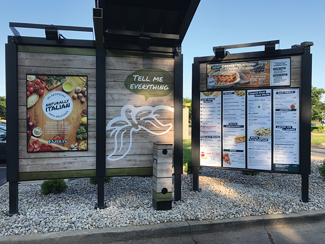
Fazoli’s brought the inside outside as part of a signage upgrade of its drive-thru. The goal of the upgrade included highlighting freshness, furthering the branding, emphasizing value and making the entire experience more pleasant.
Signage can do all of this — and more. It’s key to any restaurant, starting with the exterior sign and any window signage and continuing into the restaurant with the menu in fast-casual and quick-serve restaurants, along with any directional signs.
Done right, signage emphasizes your brand, aids customer decisions and directions, and unifies your restaurant, says Ray Camillo, CEO and founder of Blue Orbit Restaurant Consulting in Atlanta. “I can’t emphasize how vital signage is,” he adds.
Fazoli’s recent focus has been on its menu boards. To emphasize freshness and warmth, the Lexington, Ky.-based chain brought out some of the earth tones the company uses on the restaurants’ interiors and used them for the background on the drive-thru menu boards. The drive-thru menus now feature more photography of fresh ingredients — garlic, broccoli, herbs — alongside images of the menu items, continuing the visuals the restaurant uses inside its locations.
Fazoli’s added a presell menu board that features limited-time offers and specials, among other items, to whet customers’ appetites and help them make purchasing decisions. Both updated menu boards, says Chris Byars, Fazoli’s director of construction and design, helped take the restaurant chain “from a QSR look to something more contemporary, closer to a fast casual,” he explains.
Camillo is a big fan of presell boards in drive-thrus. “Make sure people have the opportunity to decide what they want before they get to the speaker,” he says. “And while you’re at it, try to walk around your property regularly to make sure landscaping doesn’t obscure this board or the menu board.”
Drive-thrus are an important focus for Fazoli’s, Byars says. “Fazoli’s generates about 40 percent of its business through drive-thru, and we recently redid all signage to emphasize value for families picking up dinner,” he says. “The drive-thru, along with off-premise sales, is where our growth is coming from.”
To date, Fazoli’s has refreshed nine units and opened four with the new design and plans to roll it out across its portfolio of stores.
 The revamped Wayback Burgers menu board features concise descriptions of the food the chain sells along with a few strategic features. Photo courtesy of Jake’s Franchising
Interior Menus
Wayback Burgers is changing its interior menu boards with the goal of making the ordering process faster for guests, highlighting the best-selling items and upscaling the brand.
The new menu board design has already rolled out in some of the Cheshire, Conn.-based company’s international units, and the first redesigned U.S. store opened in Irving, Texas, in August. All new units, around 20 this year, will have this new design, and retrofitting the current 150 stores will be the next stage, says Patrick Conlin, senior vice president.
The chain has a traditional format PVC menu board. Eliminating the former menu frame has added an extra four inches of space, giving it a cleaner appearance. The new menu board highlights that guests can craft their own burgers. “We put that in its own section, front and left, so it’s the first thing people read,” Conlin says. “‘Craft your own’ got lost before, and we really wanted it to say ‘craft’ (instead of the former ‘create’) so it sounded more upscale.”
Wayback Burgers also upgraded its food photography “so the food really pops off the menu board,” Conlin says. To do this, Wayback’s graphic designers enhanced the photography by focusing on the food, the lighting, and the background and making the pictures larger. The background of the menu board has been changed from light to dark, which helps enhance the food photos and adds to the upscale appearance.
In addition to redesigning its menu boards, Wayback Burgers also redesigned its menu. The company did away with low-selling items and now highlights other options such as chicken dishes and veggie burgers. “This speeds up the ordering process because there’s less to choose from and we have easier execution,” Conlin points out. The new board also highlights combo meals, and sales of these are up.
World Wrapps, a two-store concept based in Corte Madera, Calif., changed its menu boards to feature more pictures. Dava Guthmiller, founder/chief creative of Noise 13 in San Francisco, worked with the chain to minimize text, though it was careful not to put so many images on the menu boards that they felt touristy. “We felt the pictures helped explain the variety of the wraps,” she says.
And at Lappert’s Hawaii, a five-store ice cream chain that’s another Noise 13 client, the menu divides into pieces that customers can read along the wall while waiting in line. “The menu gives some storytelling, and it runs along the wall on multiple posters that tell about the different types of products,” says Guthmiller, who worked on the signage. “It goes into depth about flavors and things customers can choose and whether they would like a shake or a cone or a bowl.”
However, Guthmiller adds, in touristy locations, Lappert’s menu boards do a lot more storytelling, such as where the ingredients are from or whether they’re organic — the deeper things that make the food more special. If frequented by locals, the stores do less. “You have to think about your audience,” she explains. “Are they coming back, or are they just coming once?”
The Cowfish in Charlotte, N.C., is a playful sushi and burger brand with five locations that likes to continue its fun, lighthearted vibe throughout its signage. In its takeout area, alongside the pickup sign, sits an animated cow that’s lifting a fish over its head, tying together sushi and burgers. “We try to position these signs so they can be seen from the door,” says Co-Owner Marcus Hall. “They’re irreverent and another opportunity for our guests to say, ‘Wow, there was some thought put into that.’”
The Cowfish restaurants also use the concept’s logos of a burger, a piece of sushi and a cocktail glass strategically throughout. Not only are these elements on employee uniforms, chopsticks and takeout bags, but they’re also included in exterior awnings and signage.
 To emphasize freshness and warmth, Fazoli’s brought some of the wood tones the company uses on the restaurants’ interiors and used them for the background on the drive-thru menu boards. Image courtesy of Fazoli’s
Out Front
It’s easy to spend a lot of time on the signage inside a restaurant and drive-thru and ignore the front. That’s a big mistake, says Camillo. “It’s vital, especially for fast casual because you’re often in a strip mall and in competition with other brands,” he says. “Plus, strip malls are notorious for having landscaping between the restaurant sign and the road, and the most important thing is that the person driving by at 35 mph can read it.”
Abigail Plonkey, director of brand experience design, OZ Architecture, Denver, describes exterior signage as “the jewel to your design and a way to breathe life into your concept.” Because of this, she says it’s crucial that a restaurant’s exterior sign expresses the experience the restaurant will provide and helps it stand out from other signage.
Plonkey points to the example of Henley in Nashville, whose exterior sign features gold leaf and an image of a woman from the 1920s. “It’s a balance of masculine and feminine and is soft and opulent and fun and playful, which explains the brand,” Plonkey says. Plus, the gold “adds a little punctuation and sparkle to the side of an otherwise simple building.”
Wayback Burgers rolled out a new, cleaner logo, Conlin says. The colors of the new logo have changed. Red has been eliminated in favor of black and white, which stands out more, Conlin explains. The logo now adapts easier to signage “for maximizing the size of the sign based on different municipalities’ permitting requirements,” he says.
Logos are important because they’re easier and faster to read than a name, Camillo says. Operators should pay careful attention to the colors they use — blue is a poor choice because it’s harder for the human eye to distinguish. And of course, black and shades of black work really well.
Good logos do an especially huge favor for brands in strip malls with a monolith sign at the entrance listing all the brands in the mall. “Sometimes the only way to stand out is through your logo,” Camillo says, “and on that monolith, it can really help businesses who are tucked away.”
Menu Board Do’s and Don’ts
Ray Camillo, CEO and founder of Blue Orbit Restaurant Consulting in Atlanta, offers his advice on working with menu boards:
Do
- Make sure fonts are large enough. “There’s an engagement point where if guests stand too close, the cashier feels obligated to ask if they can take their order,” Camillo says. He recommends that guests be able to read a menu board from about 15 feet away.
- Consider scrolling images. McDonald’s has done a great job with this, Camillo says. The chain features several scrolling items and engages customers.
- Make sure your menu board flows from left to right, with appetizers on the left and desserts on the right.
- Highlight features like gluten-free or vegan, and make sure your legend (if you’re using symbols or colors) is easy to find on the menu board.
Don’t
Don't
- Change your menu board design. Camillo says that if a section features pictures, don’t make it suddenly switch to text — it’s confusing and makes it difficult for the guests to keep reading the menu board.
- Think you can do without a menu board. Guests need to make a decision about eating with you as soon as they come inside, Camillo says. “They need to understand what you are, what you serve and what your prices are. They want to make a decision before they commit and talk to the cashier.”
- Write long item descriptions. Keep descriptions to three words, five at the most. “If people are reading, they’re not ordering,” Camillo says.
